


Chartres, France
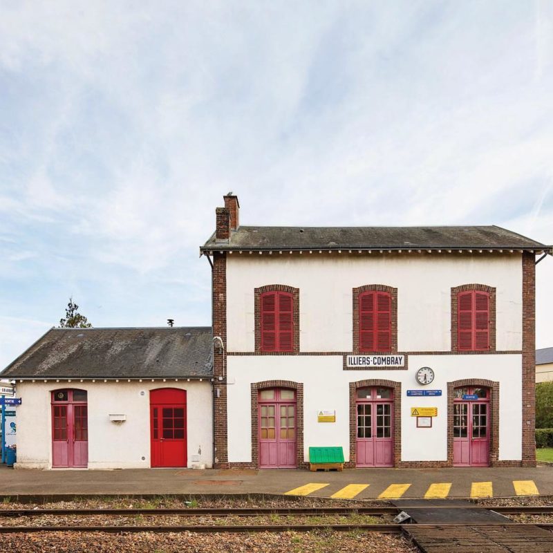
Illiers-Combray Station
This French train station is located in a town renamed after the famed writer Marcel Proust's fictional name for the village.


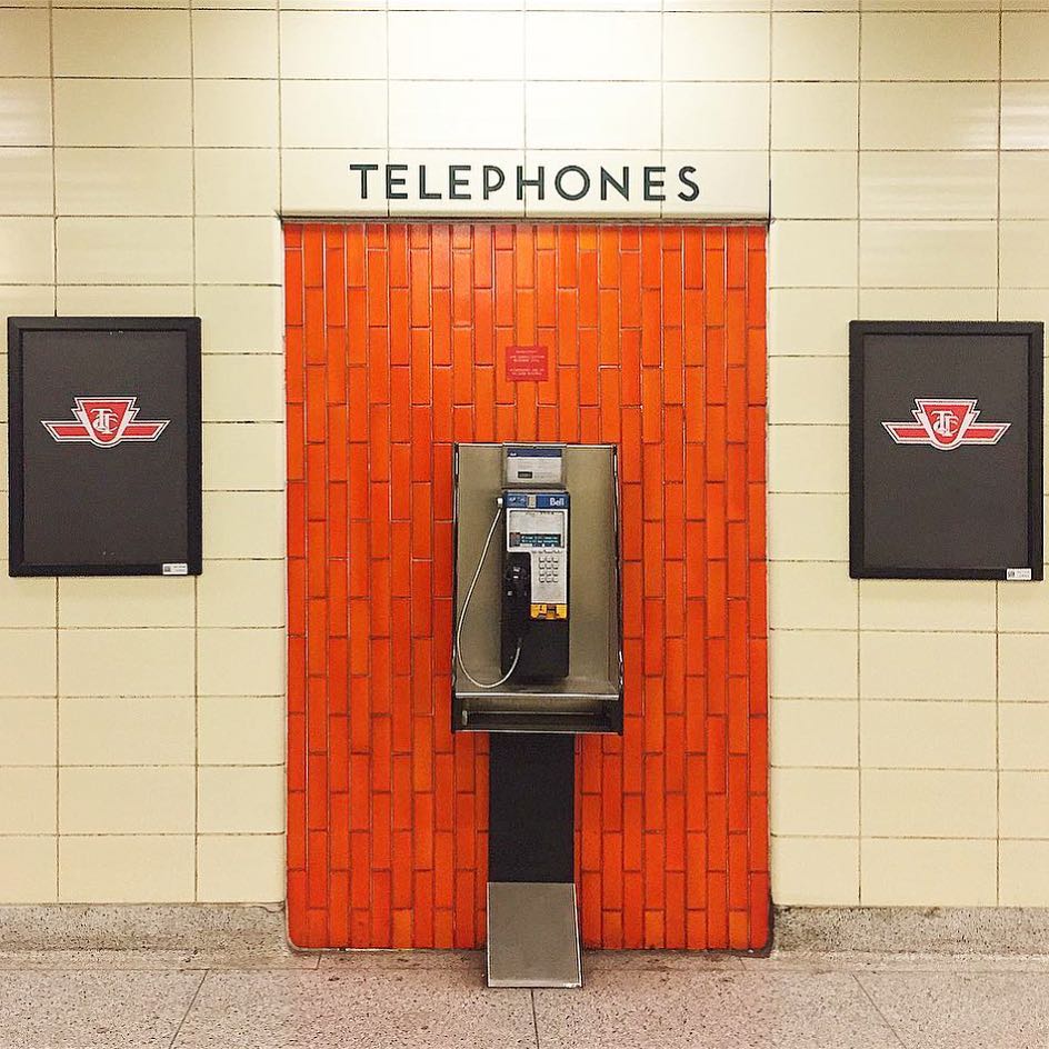
Toronto, Ontario | C.1968
The Toronto subway has a typeface all its own: a graphically unique rectangular sans serif, exclusively upper case. It is primarily found in older subway stations in Toronto, which feature a washroom-tile aesthetic.
The original font, though revered, is anonymous—it has neither a known creator nor an official name. The Toronto Transit Commission (TTC) refers to this orphan as “Station Font.” (The name has not yet taken root with avid transit or typography fans.)
In the late 1990s, as newer stations began adopting easily identifiable typefaces such as Helvetica, artist David Vereschagin became determined to recreate the TTC’s birth font, “to rescue the Toronto subway typeface…to ensure its continued existence.” He visited stations, took photographs, and made rubbings of the letters, and issued a new “Toronto Subway” typeface that served as an extremely close reproduction of the original. It’s so close, in fact, that the TTC adopted and now uses it widely throughout their stations—and above any remaining public phones that exist.
 43.65014, -79.483843
Partner

This French train station is located in a town renamed after the famed writer Marcel Proust's fictional name for the village.
This Argentinian transportation service is known as the "Train of the End of the World".
Max file size is 40MB. JPEGs are preferred.
You do not have permission to view this form.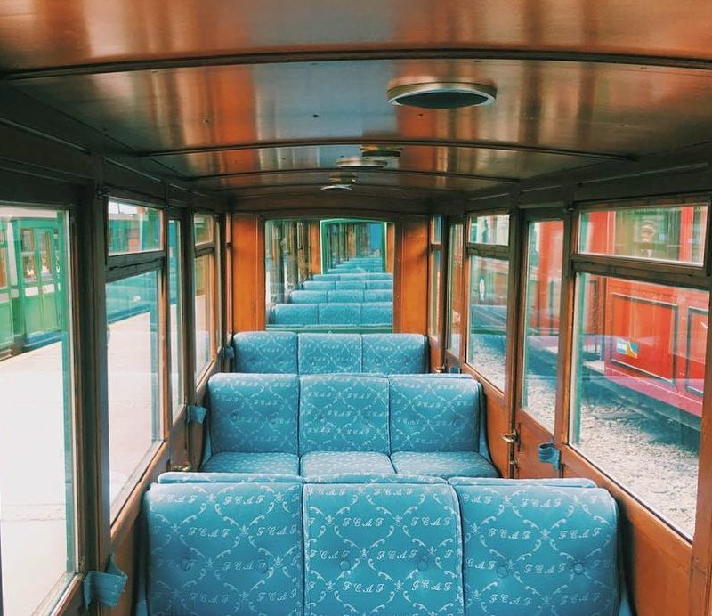

But how long will these pay phones be around?