


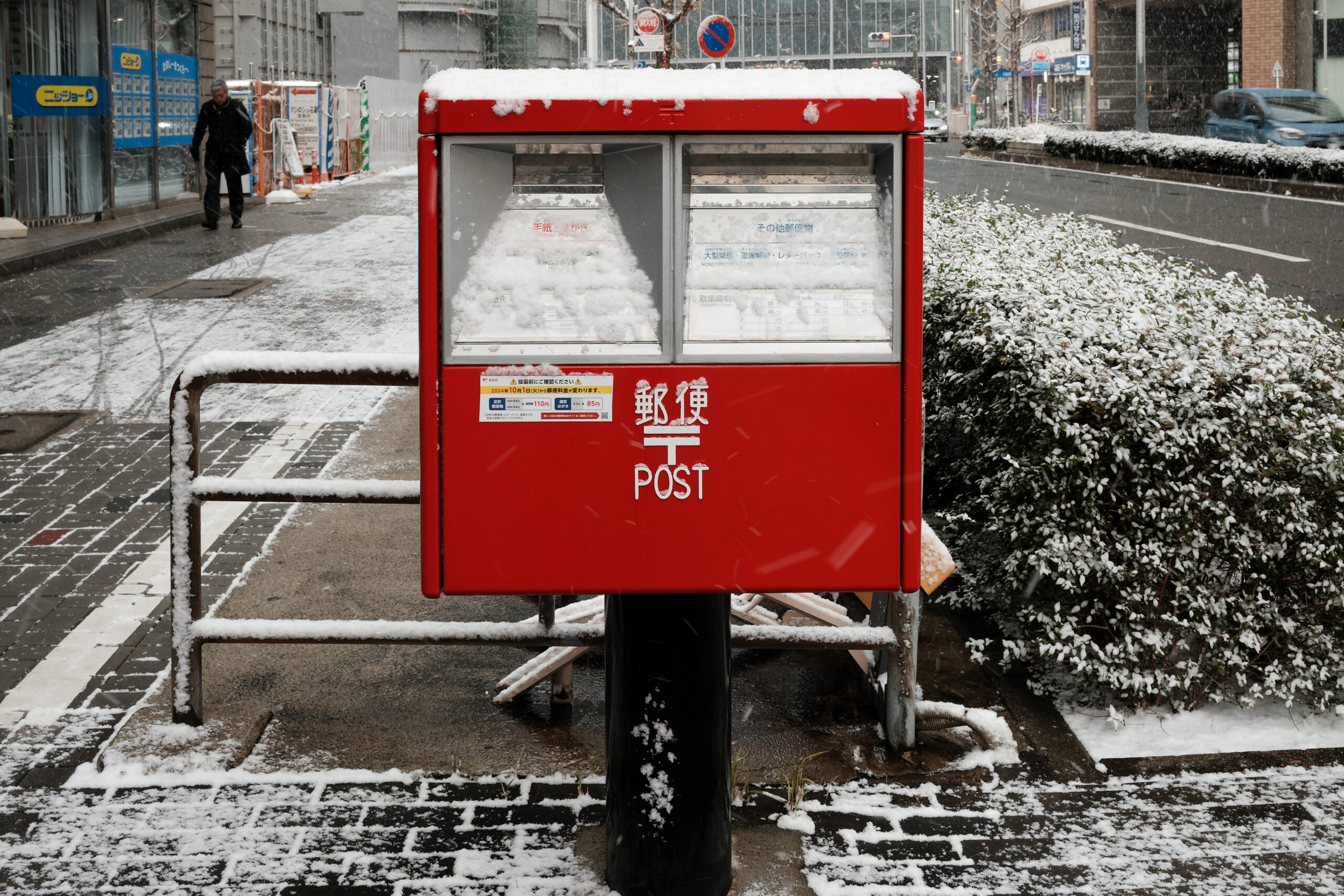
For thirty years, Japan’s first mailboxes were painted black, the same color as public toilets. In dim gaslight, passersby routinely confused the characters for postal box (yuubinbako) with toilet box (suibenbako), creating what officials politely called sanitation problems and public embarrassment. This is, depending on your disposition, either a cautionary tale about signage or an extremely relatable mistake.
The switch to red in 1901 solved more than a visibility issue. The color was chosen for practical reasons first: legible at distance, readable at dusk, hard to confuse with a toilet. But red carried other freight in Japan. It connected to centuries of lacquerware tradition, to torii gates and postage stamps, to a color that had long signaled both importance and energy. The mailbox, in acquiring its new coat, quietly joined a much older conversation.
Today the boxes are one of Japan’s more quietly insisted-upon icons. Regional variations exist: character-themed boxes, commemorative editions, local designs that suggest a country genuinely invested in what its mailboxes look like. The postal symbol 〒, stenciled on every one, has its own origin story that researchers continue to debate with more passion than the subject might appear to warrant. The red, at least, is settled. It took thirty years and considerable public embarrassment to get there, but the result has proven durable.
 35.173081, 136.8823772